
The brief
The mineral water industry is highly competitive, with plausible brand loyalty, as water is seen as an essential commodity.
The success of this project was going to be heavily reliant on a unique visual identity. It can strategically position them as more of a healthy, sustainable and eco-friendly lifestyle brand seeking to protect the Himalayas from climate change.
Competitor analysis


Logo sketches & label prototype

Final logo
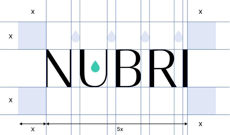
Nubri is built around a single drop of water, held in the U like water in cupped hands.
The drop also sets the spacing: each gap between letters is exactly one drop wide.
It sits in the true centre of the U and lines up with the middle of the B and R, so it reads as part of the word.
Only the drop is in colour, so it’s the first thing you notice.

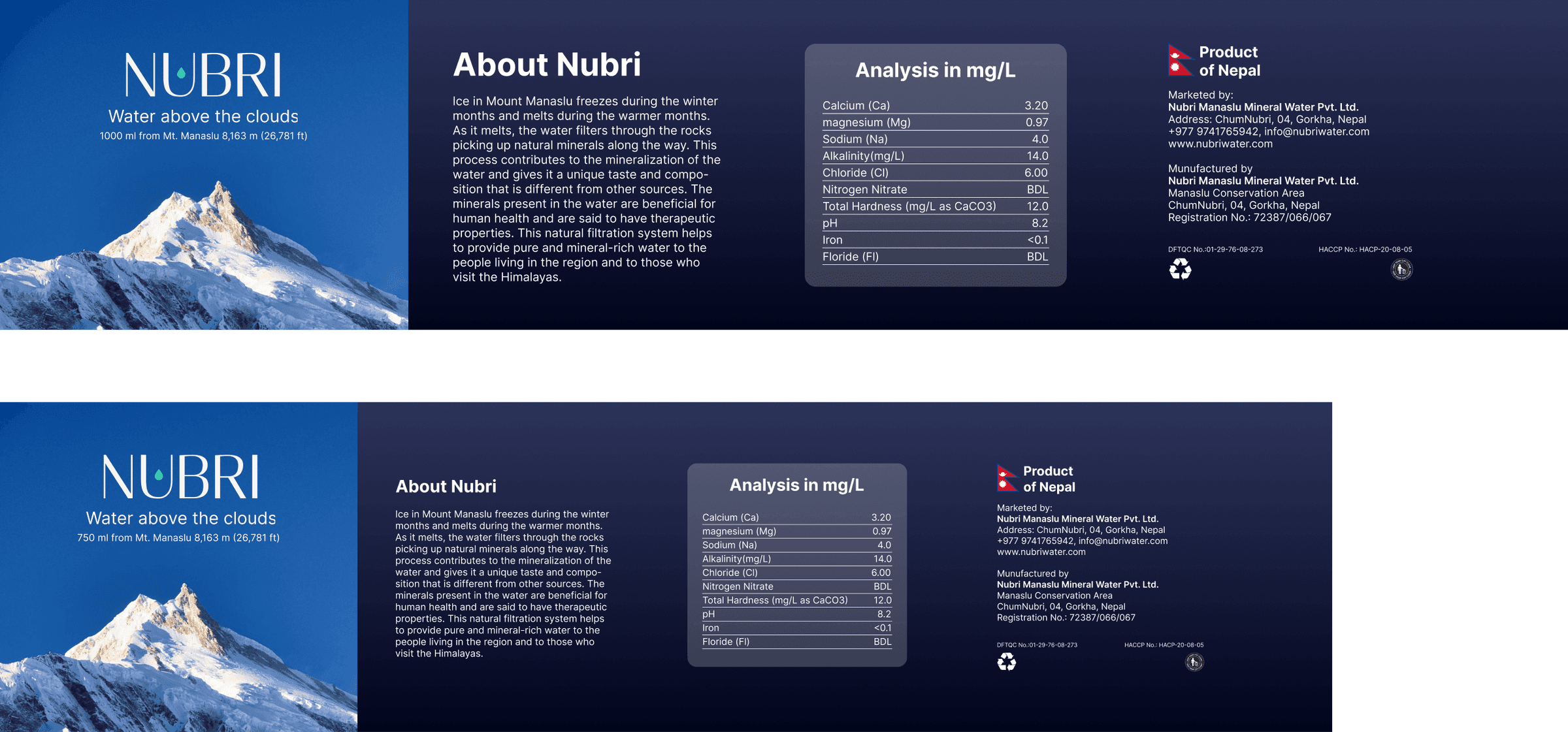
Bottle labels
Brand sheet

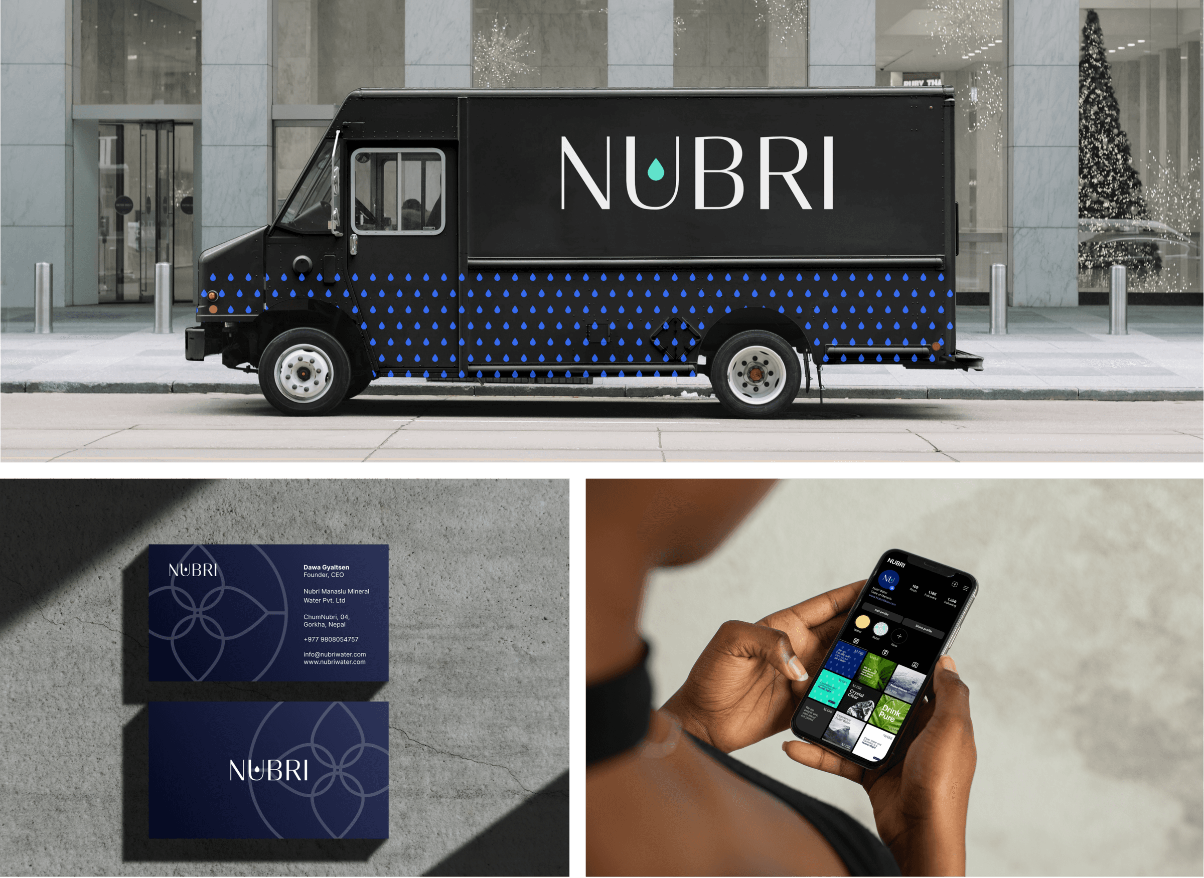
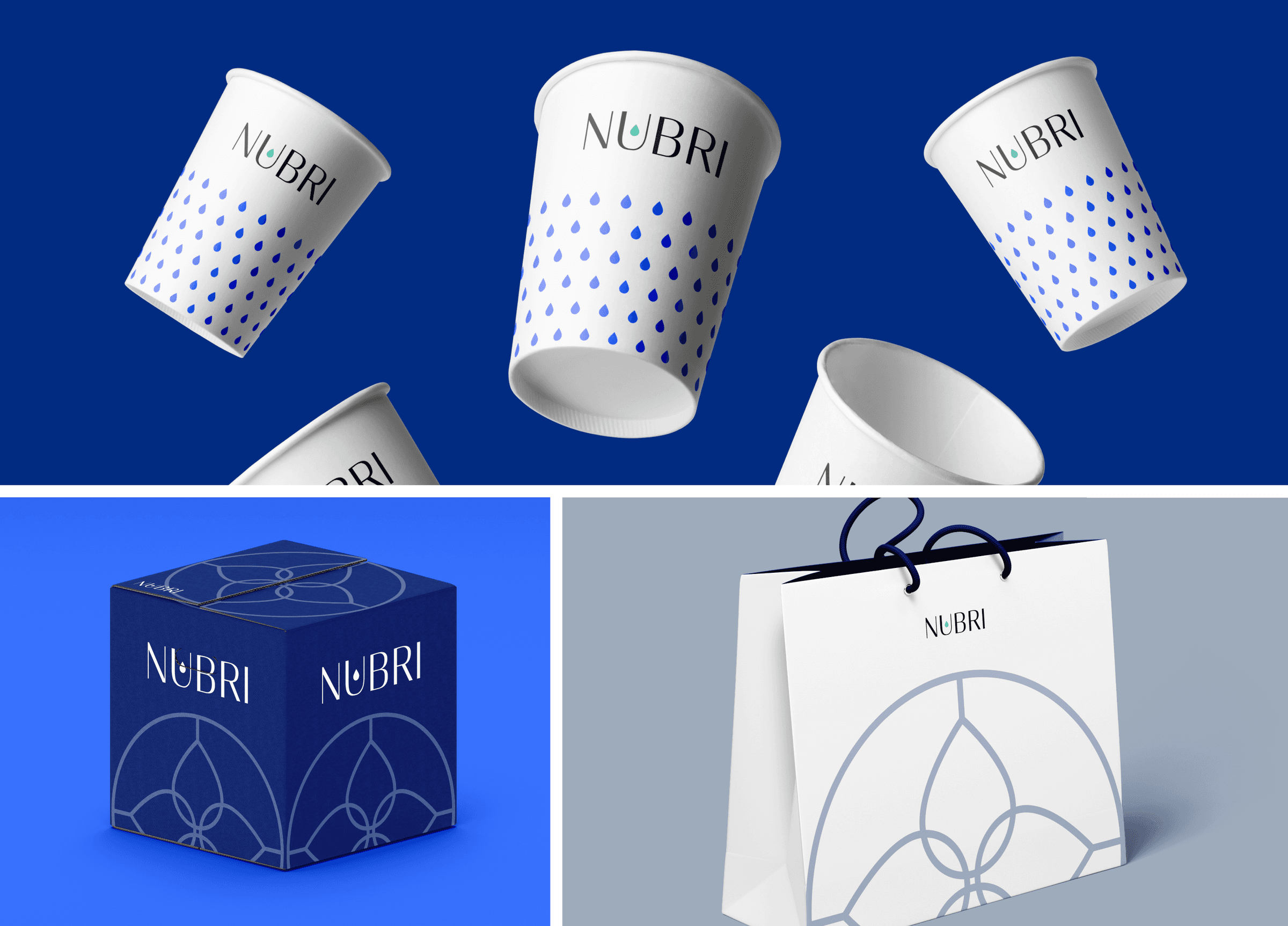
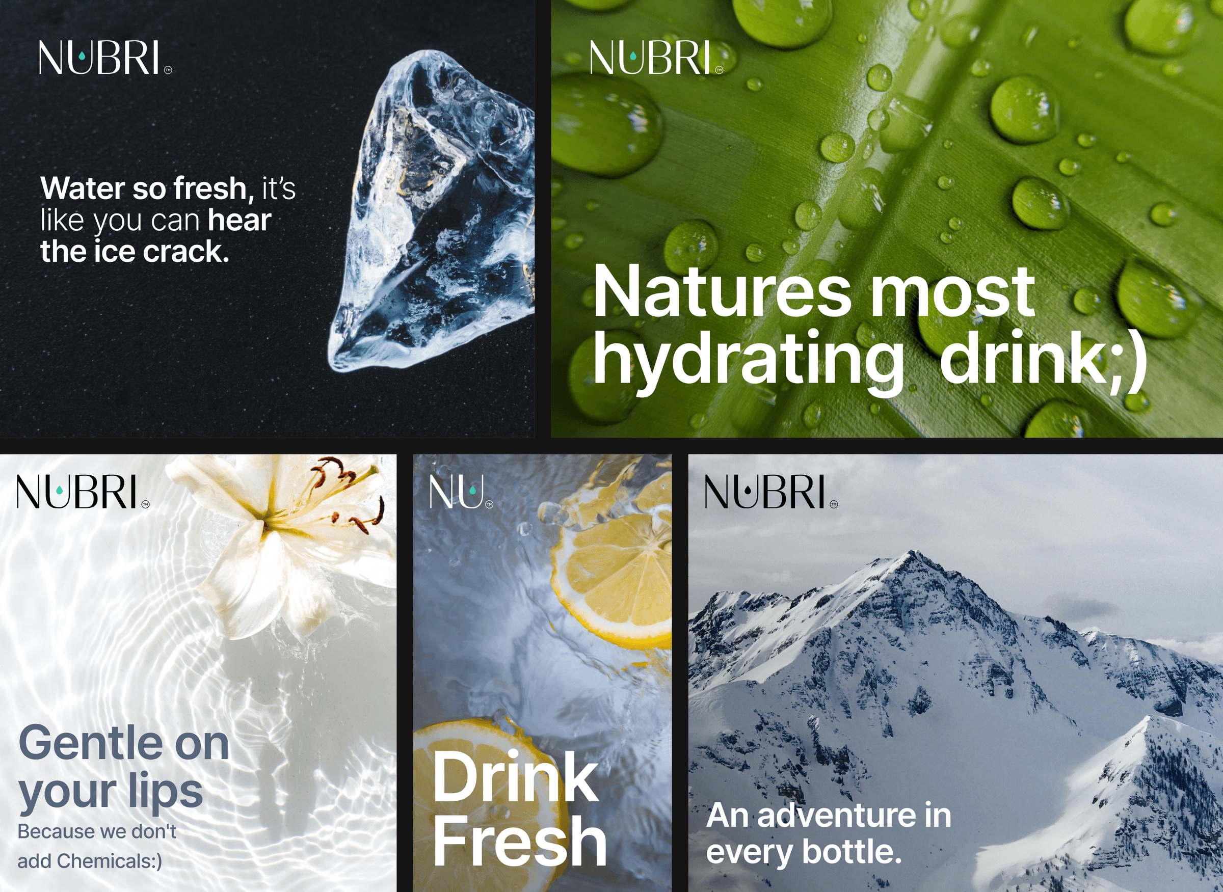
Promotional marketing
Office collaterals